How to Create App Icon? (Best Practices for Icon Designs)
App icon design is one of the most essential steps in creating an App when it has such a huge impact on the CTR (Click Through Rate) in stores. If you are just starting here, don't worry, this article is to guide you through the easy and principal method to create an app icon.
Overview of How to Create An App Icon
When we just got an app interface or just a prototype, how to create an app icon for that? How can we draw an icon that suits it and in the meantime make it stand out in the app store?
Every time I have no idea where to start when being asked to make an icon, I suffered. I often spend a whole day drawing one without meaning. The pain is that I didn't know how to draw an icon that conforms to the app interface style or app design concept. So I read all the top free and top paid apps in the App Store and combined with the theoretical knowledge learned from books, eventually I summed up the following points on how to create an app icon.
1. Metaphor
Metaphor is the first thing to consider when creating an app icon. Keep in mind what the icon will represent, and what the app does. This is very important because we are supposed to inform others of the app's functionality as they see this app icon. Almost every top-ranked app on the App Store list is successful at this goal.
For example, in Easy Cleaner, the rough image is the appearance of the “clean" button; Weibo, a software that can both read and publish posts, is represented by the image of eyes and emission waves. The eyes are a symbol of Sina - keeping the brand consistency; Forest is an application for dedication, users can obtain trees every time they reach a "focus" goal on Forest. The image of soil and saplings is to get you interested at the very beginning. These apps all start from the function point, that is, you can receive the message of app functions when you see them.
-

Easy Cleaner, -

Weibo -

Forest
Therefore, the first point is to get readers clearly know what the application does exactly, what functions it provides, and what it is that gets you to think "Oh, this app must be used for this"!
2. Competitive Analysis
After completing the first two steps, you should have your icon design for the first version (try to make several versions if you get more ideas).
Product analysis is also significant in creating app icons. For 2 reasons: first, to be inspired, and second, to improve your icon from various dimensions when in comparison with others.
App ranks in App Store and Google Play are a good place for discovering competing apps, you can view the lists of similar apps at ➡️ ASOTools store ranks ⬅️.
3. Design
After learning about the app functions, we'll use the icon to reveal them. So you should at least have an outline in your mind (remember to take a pen and record it at once), then we start to make a fuss on this outline. Get inspiration from the following points:
a. Simplex
A simplex in my understanding is more like a background plus a subject that summarizes the app content. Icons, such as Telegram, WhatsApp, and YouTube, all use a roughly uniform background color and an image as the main body. Two methods are usually used on creating an app icon:
- dark background to make the graphic inverse
- light background to make the graphic color
*Note: the color can be solid or gradient.
Icons like these are both simple and elegant, making them stand out among all other applications.
-

Telegram -
WhatsApp -

YouTube
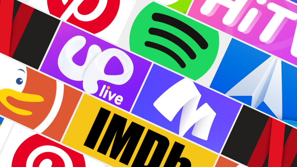
b. Circular background
The circle is a perfect shape to lead the user's visual focus on where you want it to land. There are many apps on the App Store list that adopt circles as backgrounds, such as Pinterest, Reddit, and Spotify. A circle is commonly used as the background, and the main body is added in front. The circle background can be either solid or gradient.
-
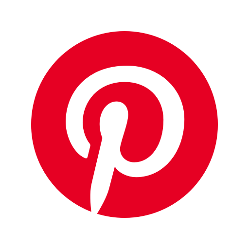
Pinterest -

Reddit -

Spotify
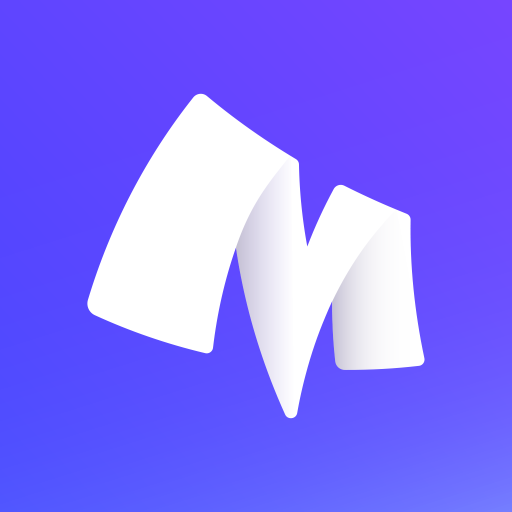
c. Text design
Generally, we only take one character, like the first letter of an English word, to put on the icon (Or a complete word for auxiliary purposes). In this way we enhance users' awareness of the brand. Examples:
-

IMDb -
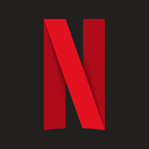
Netflix -
Menta
d. Gorgeous background
Colors are always attractive factors. Using good-looking colors can greatly enhance the aesthetics of tha app icon. Of course, matching the app interface is the premise.
-

HiTV -
Spark -

Concepts
e. Color overlay
Superimpose multiple color blocks to make the layering blurred. Personally, I think Youku's icon looks much better than before. There is also Apple's own photo app icon, which is also very beautiful.
-

Meditopia -
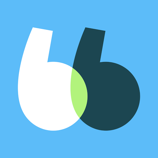
BlaBlaCar -
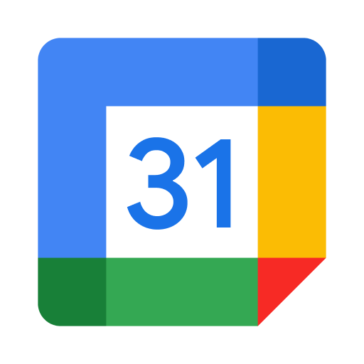
Google Calendar
f. Cartoon character
Cartoon images on app icons can reduce the distance between users and the app, which can be naughty, eccentric, a mascot, or even a smiley face, etc. When the character is mascot stuff, the brand's recognition will be increased at the same time. We are all quite familiar with those characters:
-

Bigo Live -

DuckDuckGo -
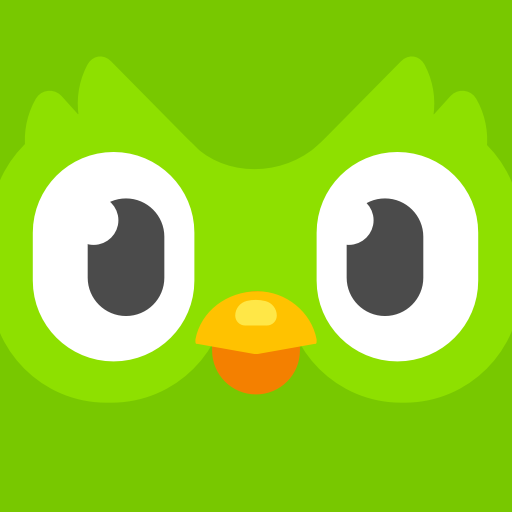
Duolingo
g. Apply grid lines when drawing icons
When drawing iOS application icons, apply the iOS icon grid lines, which help to establish a perfect ratio for apps (the golden section line is widely used in creating iOS system applications) and maintain harmony with the system apps.
To increase your app visibility in app stores after creating the app icon and making it published, you can try ➡️ ASOTools ⬅️ for App Store Optimization practices.