Crafting a well-designed app icon is essential for user interfaces, as it serves as a concise representation of the application's core idea. This article explores the significance of app icons and offers guidelines on how to create icons that effectively communicate the purpose of the app. By following best practices such as simplicity, platform consistency, and avoiding excessive details and text, developers can create icons that capture users' attention and convey the essence of their applications.
Why iPhone App icons play a vital role in ASO?
App Store Optimization (ASO) is the practice of enhancing mobile apps’ visibility and findability within app marketplaces, such as Apple’s App Store and Google Play Store. It encompasses various strategies and tactics to boost an app’s position in search listings, ultimately driving more organic downloads.
ASO encompasses different factors that contribute to an app's visibility, including app title, keywords, app description, screenshots, app ratings, and reviews. By optimizing these elements, developers and marketers aim to increase their app's visibility in relevant search queries and categories within the app stores.
Now, let's discuss the importance of iPhone app icon designs in ASO:
1. First Impression: The app icon is the first visual element users see when browsing through the app store. A well-designed and eye-catching icon can create a positive first impression and entice users to click and explore the app further. It plays a crucial role in capturing users' attention among numerous competing apps.
2. Click-Through Rate (CTR): The app icon significantly influences the CTR, as it serves as a visual cue for users to click on an app's listing. A compelling and visually appealing icon can increase the likelihood of users clicking on the app, leading to higher app page visits and potential downloads.
3. Branding and Recognition: A unique and recognizable app icon contributes to establishing a strong brand identity. A consistent icon design across different platforms and app versions helps users identify and associate the app with its brand. This recognition can improve user trust and encourage downloads.
4. Differentiation: In a highly competitive app market, a well-designed icon can differentiate an app from its competitors. An icon that stands out with its unique design, color scheme, or visual style can attract users' attention and make the app more memorable among similar offerings.
5. App Store Search Results: Although the app icon doesn't directly impact keyword rankings, it indirectly affects an app's visibility in search results. When users search for specific keywords, the app icon appears alongside the app title and preview, influencing users' decision to click on the app listing. A visually appealing icon can make an app listing more enticing and increase the chances of getting clicked.
6. User Perception and Trust: A professionally designed app icon reflects the quality and credibility of the app. Users often associate an app's visual appeal with its overall user experience. A well-crafted icon can convey professionalism, attention to detail, and a positive user experience, thereby building trust and encouraging downloads.
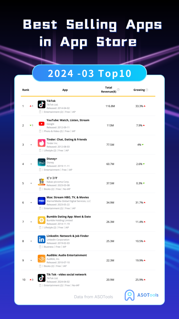
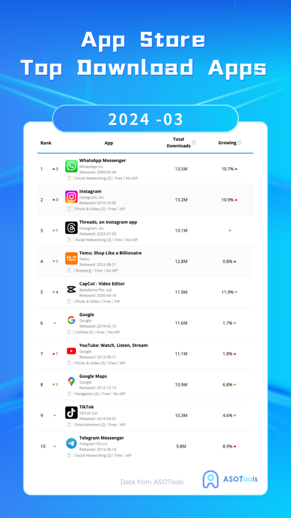
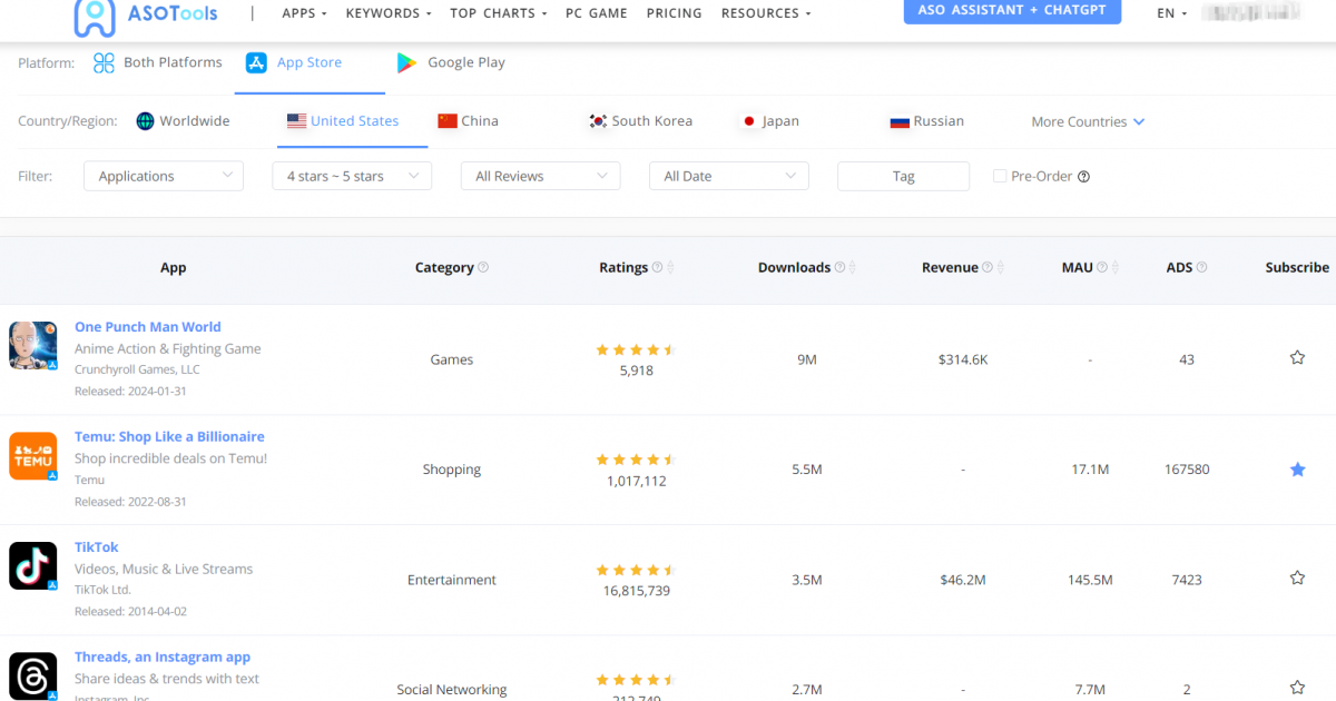
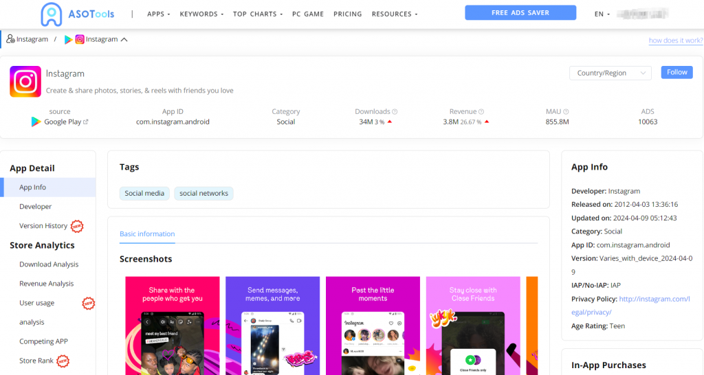
To maximize the impact of ASO, it is crucial to dedicate sufficient time and effort towards crafting an app icon that aligns with the app's branding, differentiates itself from competitors, and resonates with the target audience. Regularly evaluating and refining the icon's performance, in conjunction with other ASO elements, can result in heightened app visibility, increased click-through rates, and enhanced download numbers. Game and app developers, along with app optimization specialists, can effectively leverage ASOTools to optimize their app icons and bolster their overall ASO strategies. ASOTools facilitates comprehensive monitoring of competitors' app data, including app icon updates, enabling users to stay informed and maintain a competitive edge.
iphone App icons Design Principles
App icons play a crucial role in communicating the purpose and personality of your app or game. They serve as a visual representation of your product and can significantly impact its recognition and appeal in the App Store and on users' devices. Here are some key points to consider:
1. iphone App icons Design Principles:
The icons should be designed in a way that makes them easily understandable and recognizable. They should convey the main concept or purpose of the app using a clear background to emphasize the main image. Intricate details should be avoided, especially those that may become less visible at smaller sizes.
2. Cross-Platform Consistency:
If the app is available on multiple platforms, it's essential to maintain visual consistency while adapting to the unique style guidelines of each platform. This helps users recognize the app across different devices and platforms.
3. Text Usage:
Minimizing the use of text in icons is recommended, unless it is absolutely necessary for conveying the app's core functionality. Text can be challenging to read at smaller sizes and may compromise the uniformity and accessibility of the icon.
4. Graphics vs. Photos:
Using graphics instead of photos in icons is preferred because they tend to maintain clarity even at small sizes. Additionally, using graphics helps avoid replicating specific user interface elements, ensuring the icon remains distinctive.
5. Optimizing for Different Sizes:
Icons should be adapted to specific contexts, such as Spotlight search, settings, and notifications. This ensures that the icon remains clear and legible across various dimensions and sizes, providing a consistent user experience.
6. Full Bleed Square Images:
When designing icons, it's important to consider system adjustments that may occur on different platforms. Icons should be created in a way that they look natural and visually appealing, even with potential scaling and movement.
7. Alternative Icons:
Offering alternative icons, where supported, can enhance user engagement with the app. This feature allows users to customize the app's appearance on their home screen, adding a personal touch to their experience.
8. Platform Guidelines:
Following platform-specific guidelines is crucial. This includes adhering to requirements such as specific icon shape, shadows, and borders. For example, iOS and iPadOS settings icons should not have extra borders, and macOS icons should have uniform shadows.
9. Resources and Templates:
Apple provides Design Resources that include templates to assist developers in creating icons that meet platform requirements. These resources can be valuable references and aids during the design process.
10. Compliance:
It's important to ensure that app icons do not replicate Apple hardware products and adhere to the guidelines outlined in the App Store review process. Violating these guidelines can result in rejection during the app submission process.
11. Size Requirements:
The article provides detailed information on icon size specifications for each platform. Developers are required to provide icons in the appropriate dimensions to ensure optimal display and visual quality.
12. Safe Area and Cropping:
Developers should consider the possibility of content cropping due to scaling and movement, especially on platforms like tvOS. Leaving adequate margins within the icon design helps ensure that the content remains intact and visually appealing in various contexts.
We delve into the intricacies of creating outstanding, Apple-compliant app icons that ensure consistency and provide a seamless user experience across diverse devices and environments. Moreover, we meticulously examine ten remarkable app icon examples, specifically tailored for Apple platforms. These case studies demonstrate the prowess of meticulous icon design in capturing users' attention and effectively conveying the essence of the corresponding applications. By scrutinizing these exemplars, developers can derive valuable best practices and creative inspiration to forge their own captivating app icons.
Ten Notable iPhone App Icon Designs for Apple Platforms:

Instagram: A simple camera shape with gradient background, emphasizing photo sharing. It aligns with iOS design language.
Facebook: A blue and white "F" represents the social media platform, staying simple and recognizable, adhering to iOS design guidelines.
Spotify: A green circle with a black music note symbol, simple and engaging, consistent with iOS design style.
Evernote: An elephant silhouette with green and white colors, reflecting the note-taking and organization app's function.
Shazam: A blue, distinctive symbol representing music identification, simple and distinctive.
Airbnb: A "Δ" shape with a gradient background, symbolizing housing and travel, highlighting Airbnb's identity.
Slack: A colorful "#" symbol, showcasing the team communication and collaboration tool, simple and vibrant.
Pinterest: A red uppercase "P" representing the inspiration and creativity platform, simple and recognizable.
Uber: A black and white "U" shape, emphasizing the transportation service, simple and clear.
WhatsApp: A green phone icon and white message bubble, indicating instant messaging functionality, simple and intuitive.
These examples demonstrate how to create visually appealing and easily recognizable icons by keeping them simple, clear, and tied to the brand, while maintaining consistency with iOS design principles. Each icon stands out within its respective category, showcasing the power of a well-designed app icon. Please note that these examples are based on older information, and there may be new design trends and changes in practice.
Grow Your App Business Now!
#1 ASO TOOLS--Drive organic growth with our app store optimization tools.
SIGN UP FOR FREE!