App Store Icon Aesthetic: How to Create An Amazing App Store Icon?
The app icon defines the brand and directly affects the user's first impression of the app. If the app icon leaves a bad impression on the user, then the user may choose a competitor. So, how can we create and design an aesthetic app store icon? Nine marketing experts shared their insights on these issues with us.
Daivat Dholakia——Force By Mojio
There are some core tenets to keep in mind when designing an app icon. It should be simple. It should be scalable. It should be distinct. It should use bright or stark colors that contrast with each other to create a striking image. It should provide a good representation of your business, whether through literal or abstract depiction. It should be memorable.
I always recommend using Adobe Illustrator to decorate app icons since it can create graphics that look great and clean at all sizes. If you’re not a creative type of person, it may benefit you to hire a visual designer who can help you create your icon.
While both Google Play and the iOS App Store ask for square icons, they have some different requirements. Google Play requires a 32-bit PNG and specifically says not to add a shadow, as the store provides one automatically. The iOS App Store asks for a JPEG or PNG file that is one layer, not transparent, and 1024 x 1024 pixels. Each has its own set of guidelines for app design that developers should check out during the design process.
Dan Bailey——President of WikiLawn
My best advice for app icons is to look at good design principles. Vector is a must because you can resize it for multiple formats without losing any image quality. You'll also get crisp lines that are readable in the tiny sizes typically associated with app icons.
A high contrast color palette tends to do well, though some apps use a monochromatic style to standpoint. Stick to simple, geometric shapes. If you want to include lettering, usually only one or two letters will be readable at that size so choose wisely.
Rex Freiberger——CEO of Gadget Review
The first consideration, is the different specifications for each app store. You'll need to look into the size and resolution recommended by the different platforms. Note that if you want to cut down on workload, you'll need an icon that can scale to many different sizes without losing quality. This almost certainly means going with a vector graphic which, unlike a raster graphic, can be scaled to any size without losing quality.
If you study the icons of the most popular apps, you'll find they're all very simple. It's a tiny space to communicate information, so you can't even rely on a brand logo to sell it. It has to be simplified even further. A minimalist design with high contrast is best. If you include any typography you'd better make sure it's readable or it's just wasting space.
Deniz Guney——CEO of Rocket Digital Limited
We are developing mobile apps and published many on the Apple App Store and Google Play Store already.
In order to create a successful and high converting app icon, you should keep in mind the following key points:- Your target audience- Branding- Colors- Complexity. The first impression is the most important. Therefore, the colors are extremely important. Basically, it is the first thing the potential customers is noticing. Which color to choose depends on the app theme and the brand, but it is highly recommended to use a “friendly” color like blue, turquoise, light purple, or also white. The background of the logo has to match with the foreground (logo or text). Especially on Google Play, it should be avoided to use a transparent background.
The complexity of the app logo design is another key point. It should be as simple as possible, but at the same time, high quality and it should also say as much about your application or brand as possible. If you already have an established brand (like McDonald's, Nike, or Adidas), it is enough just to use the specific logo, but if your brand/app is unknown to the customers, it is important to give them a slight idea of what the app is about.
Sometimes it can also be very beneficial to write the main keyword just below the logo in the app icon. It could increase the clickthrough rate when the potential customers are scrolling through the store and they notice the keyword on the logo. They are more likely to take action. Usually, the App Icons on the iOS devices and Apple App Store are rounded. On the Play Store, the App icon is square. Additionally to that the size of the logo depends on the Android device. Therefore, it is recommended to create adaptive logos through Android Studio by separately adding the background and the foreground.
Caroline——Co-founder of CocoSign
App icons are intrinsically crafted designs to be used in multiple contexts of the operating system where the users will interact with your application —including the iOS App store, and Google pay, the search results, and the home screen.
There are a few key aspects that should be considered while designing an app icon. Some of them are listed below:
Tip 1. Improve the scalability
The key aspect of any app is scalability since it will be shown in several places throughout the platform. Hence it is important that while designing an icon, you work on its legibility and uniqueness.
Instead of working on a 1024 × 1024-pixel canvas, try out the design on the device and in multiple contexts and sizes.
Focus on sustainability and maintain a unique shape or element that retains its shape and qualities when scaled.
Tip 2. Make it recognizable
It’s easy for your app to get lost in the sea of the store, and the home screen is a key component in great icon design. Have a design that creates a compelling effect on memory and develops a sense of connection on both a functional and an emotional level.
Avoid overly complicated icons and remove details from your icon this makes the experience more deteriorated
Try out several variations of your design and see which aspects of the designs catch your eye.
Tip 3. Rules for app icons on iOS app store and Google play
The Google play mobile app icon should be 512x512 pixels, and generally, it is 1024 x 1024 pixels for an iOS app store.
For the iOS app store, you don’t need a separate highlighted frame for icons: the system automatically adds a 1-pixel indentation to all icons to highlight them.
For Google play, the system will add a highlight with rounded corners. The radius is 20% of the size of the icon.
Miranda——Founder of VinPit
The work on an app-building project is incomplete without an incredible app icon. An icon on the app reflects its ingenuity. Making it is compulsory if you want to list it on any of the popular app stores. Below are some key insights you should keep in mind to design a fantastic app store icon. I would suggest that you not look out for complex design; go for a clean and straightforward app icon. An icon should define the application's motto and functionality. An unforgettable yet specific app icon would engage users to download your app.
The dimension for the icon in the Appstore should be 1024px X 1024px in PNG format. This helps add a wide layout to it, so it is easily identifiable on an iPhone’s menu or notification bar. There is no need to round the corner when Apple already rounds the app icon. Keep the symbol accessible, and don't watch out for complex designs and patterns. Also, use solid colors in your background and avoid using screenshots or photographs since they become highly concentrated as the icon's scale is reduced.
Amy Ly——A Graphic Designer
The app icon defines the brand and directly affects the user's first impression of the app. If the app icon leaves a bad impression on the user, then the user may choose a competitor.
So, as an app developer, how can I create and design an amazing app icon? What are the key points to keep in mind and what are the different rules about app icons on the ios app store and Google play?
Something you have to heavily consider for app icons is scalability. Icons get smaller when you navigate to different locations on your phone (such as settings). For this reason, you should make sure that users don't strain their eyes to locate your app icon.
Your app icon should reflect the company brand and be recognizable. In terms of design, use simple imagery that won't be lost on smaller sizes. Use contrasting colors so that text, images, and backgrounds are easily distinguished, and be sure that the icon follows sizing guidelines, as well as adheres to the style and brand used in the app itself.
Colin Barker——the CEO & CMO of the leading salt-free, non-electric whole house water filter company, FilterSmart.
As a business leader myself, I couldn't state the importance of the icon or logo used in any eCom store enough. Designing an app icon requires obtaining skills for designing or deftly using smart tools available on the internet. It should be one with the best templates charge more or less, and the rest with free access to the service. Certain tactics to consider while designing an app icon:
-- Don’t insert words on an app icon. Instead, use symbols or graphic designs that would signify the purpose of an app.
-- Considering recent design standards implies a better impact on the app design. This would reflect the service of an app to be modern and can perform with the latest effects.
-- Consider the platforms for which the app is for. It can be on an Android or IOS system. As various notions make a difference in size, shape, and recommended style.
-- Both the Android and IOS app icons must be saved as PNG files. Pixels size on Android are 96×96, 72×72,48×48, and 36×36 pixels, and that on an IOS an icon should be sized at 1024×1024 pixels. On both of these platforms, the app icon can be resized depending upon the design and context.
Gaurav Patil——Content Strategist at PayUOC
To create an amazing app icon: you can follow these the following guideline which will make your show that your app logo will stand among all of the other as an in-app market.
Make it scalable
Make it recognizable
Make it unique
Don't use words (in-app icon)
What are the key points to keep in mind and what are the different rules about app icons on the ios app store and Google play?
Limit the use of maximum components up to 3. Also, you must put less detail into your icon so that it can be easily recognizable. Avoid usage of text elements except for the brand name, given it, is not too long, and using a wide variety of colors in your icon.
Also, you must choose the correct app icon image resolution as those guidelines by Play Store or Apple app store.
Conclusion
After reading the advice from nine experts, I'm sure you have some idea about how to design an aesthetic app store icon. You may find that these experts have different opinions, such as whether you should use keywords in the App icon. I think the answer to this question is not absolute, and you can decide according to your needs.
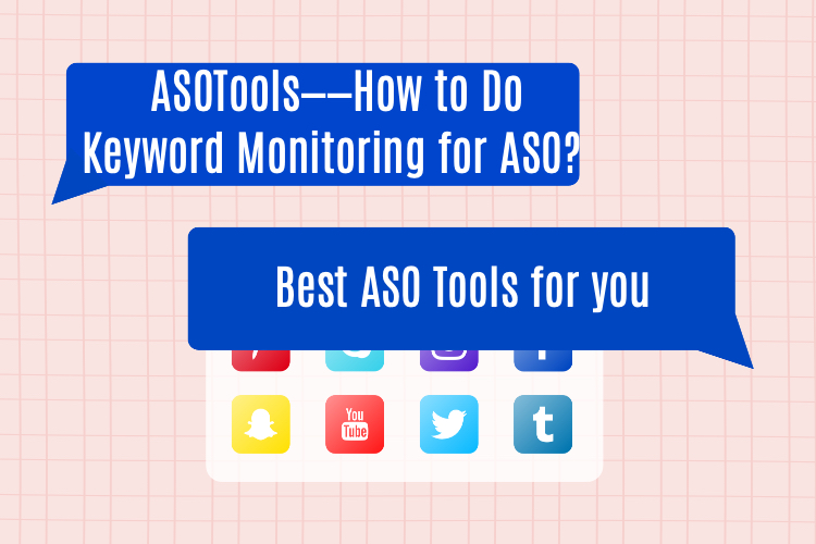
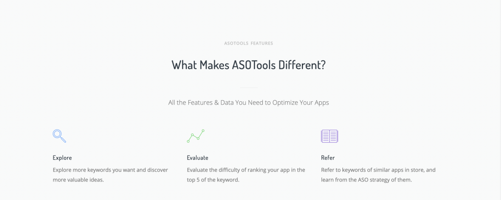
When you decide to use keywords, ASOTools, a free keyword monitoring tool, may be able to provide you with some help. ASOTools is a free keyword monitoring tool that can help you discover potential keywords as well as monitor the keywords used by competitors.
Also, if you are still having trouble with how to name your app, how to write app descriptions, how to design app screenshots, etc., you can find the answers in ASOTools. We hope our content is helpful to you.